

Entry posted by Nathan Strum
3,640 views
Man Goes Down (2004 - unreleased)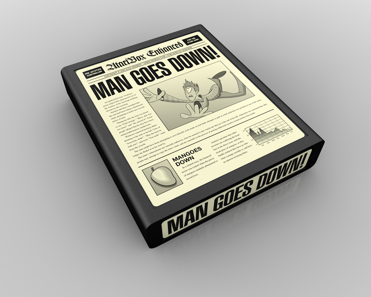
Man Goes Down is Alex Herbert's excellent, but still unfinished and unreleased platform game. This was the second contest I'd won in a row. Alex ran into health problems and couldn't get the game finished. Some time after the contest, he said he'd felt bad about my artwork not being used so he sent me a couple of his Vectrex homebrews. Super nice guy. Nobody's heard from him in years. I hope he returns to full health. Finishing the game would be nice, but that's completely secondary.
This label was almost an afterthought. I'd done the illustration of the man falling for a different label entry, and at the last minute I had the idea to make one that looked like a newspaper - I suppose because the title of the game sounded like it could be a headline. I didn't expect it to win since it was quite different from typical labels, especially with all of the nearly unreadable text on it.
The sketch of the man was drawn in Painter, then inked and colored in FreeHand, which was my vector drawing program of choice, prior to Adobe killing it off.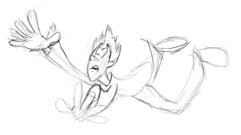
Sketches almost always look better before they get cleaned up. The spontaneity gets lost.
The label still holds up pretty well, and still has the benefit of being unique, although I'd fix a couple of things now. The man's far leg needs to be moved over because it's kind of unfortunately juxtaposed with his butt. Also, the inking on him could be better - the lines are too thin and have no character to them. The game's manual is about 80% complete and resembles a newspaper, complete with a "fun page" including a word search, Mango "fun-facts", and the first appearance of Artie the Atari, the comic strip which now runs in my blog.
Contest Entries
As for the contest entries, the first one I did was created using Infini-D for the background and text, and Painter for the man and fruit.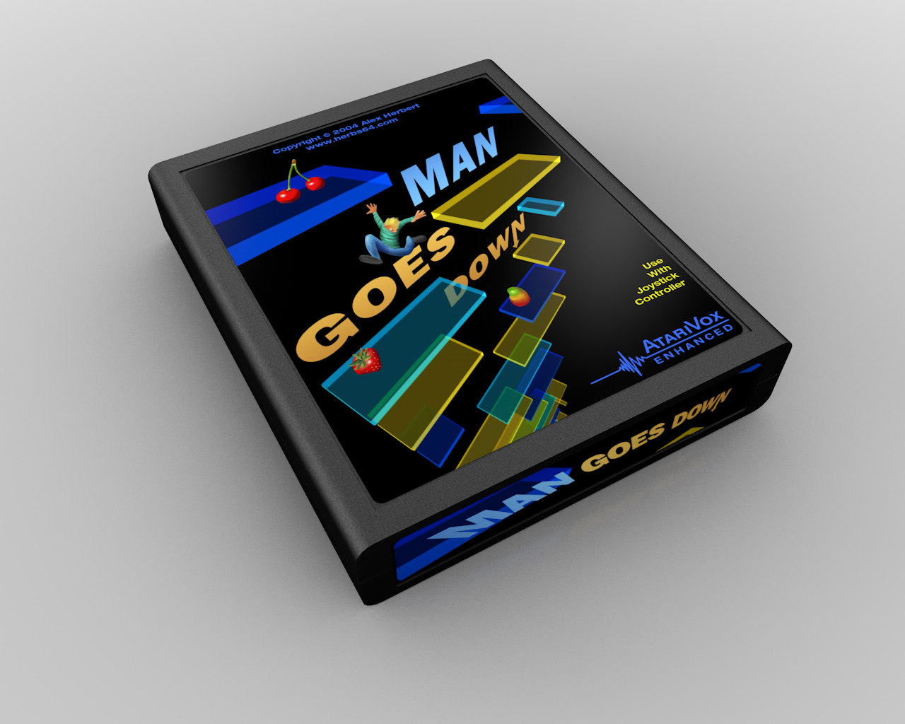
You can barely see the guy though, since he's so small.
The platforms were created (at first) by actually using platforms from the game, and extruding them in Infini-D.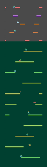

The reason I did this is that I have a tendency to try and interpret games literally (something I'll expound upon in future entries). However, I ended up going in and hand-tweaking the colors and platform arrangements since it looked too cluttered in the first pass.
I still like the look of this label. It represents the game well, and the typography has a nice 60's movie title sequence feel to it (although I'd be hard-pressed to pick a particular film). And although it didn't win, the AtariVox logo I designed for this label would eventually go on to be used as the official logo for the AtariVox speech module. (One of the prizes for the contest was an AtariVox, and they were looking for a logo to use with it.)
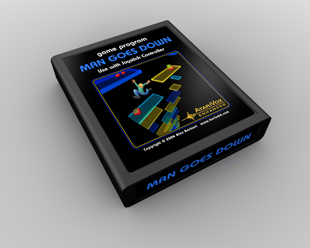
And, as with the Krokodile Cart, the now-inevtitable Atari-style variations: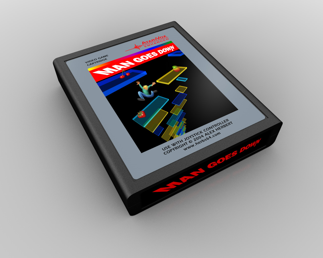
The next entry came about because the phrase "...and he stood on the platform, holding aloft a shimmering mango" suddenly popped into my head. Mangoes was a recurring theme in the labels, because in the game you collect mangoes (among other fruit), and it's a nice play on words with Man Goes.
So I threw a quick sketch together in Painter, where I also painted the character. I've always liked the "natural media" looks you can get with Painter, although it's a bit like catching lightning in a bottle. The best results often happen accidentally and (for me) are difficult to reproduce consistently. But since that's how I paint with real paints, it's a pretty accurate piece of software. ![]() And unlike inking something in FreeHand (or Illustrator), Painter lets you retain some of the spontaneity, even in the final piece.
And unlike inking something in FreeHand (or Illustrator), Painter lets you retain some of the spontaneity, even in the final piece.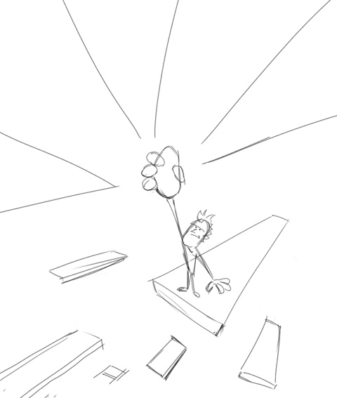

The platforms and logo were created in FreeHand, with everything else colored in Photoshop. Of all of my entries for this contest, this is my favorite. The colors are vivid, the composition has a clear focal point, it's a clean, simple, bold and easy-to-read design. Plus, I really like the logo design (something I'd repurpose for Gingerbread Man). Rarely does artwork just seemingly fall off the end of the pencil like this one did - but I'll take 'em when I can get 'em.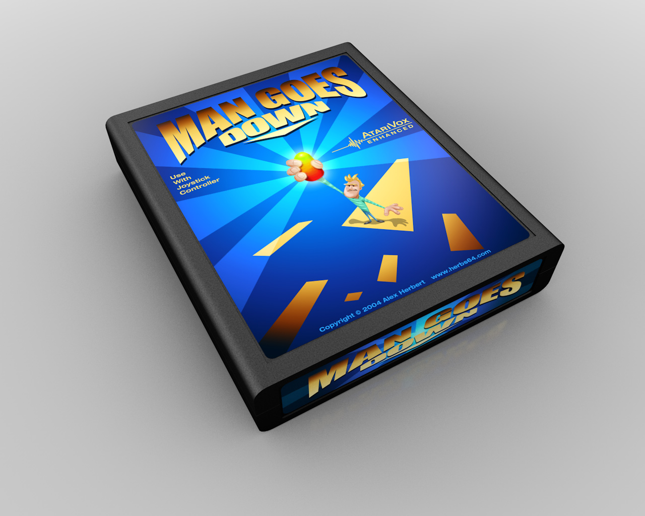
And the Atari variations: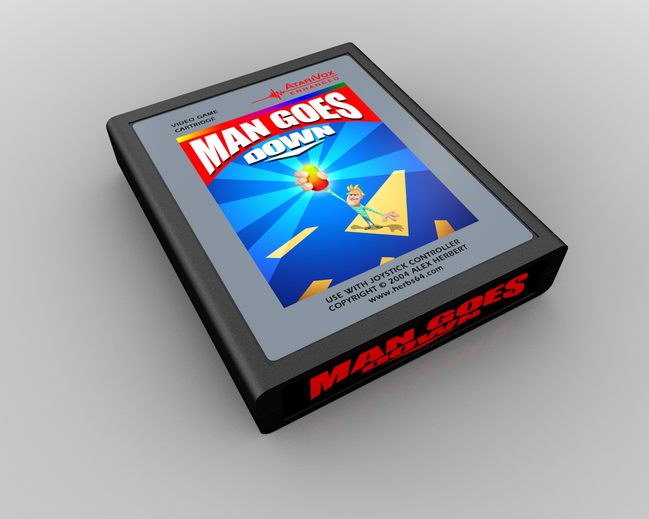
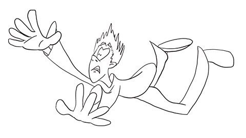
What I thought would be my last design for the contest started as a sketch (see above) where the concept was more about the character falling. Even then I didn't really like the way it turned out. The colors are a bit flat, the line quality isn't very dynamic, and the composition is very haphazard. Plus, the name of the game is hard to read. Bad logo design! No biscuit!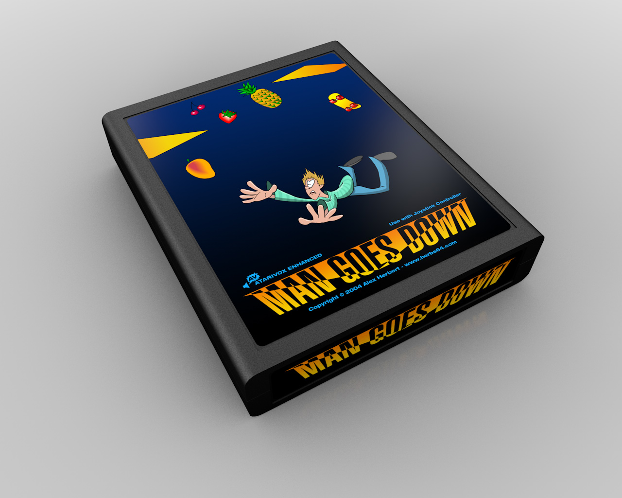
I had an earlier version of this that wasn't submitted. In hindsight, I think it actually looked a little better. The proximity of the platform makes it look like he just missed grabbing it, instead of being well past the point-of-no-return. The text is really clunky, and the blue gradients look completely out-of-place, but the composition of the drawing is much more cohesive.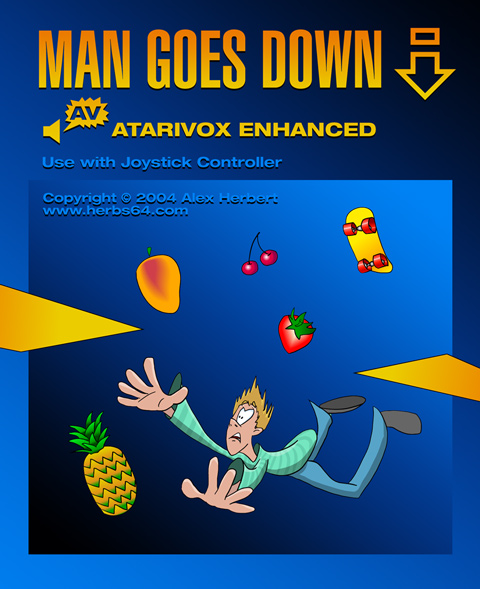
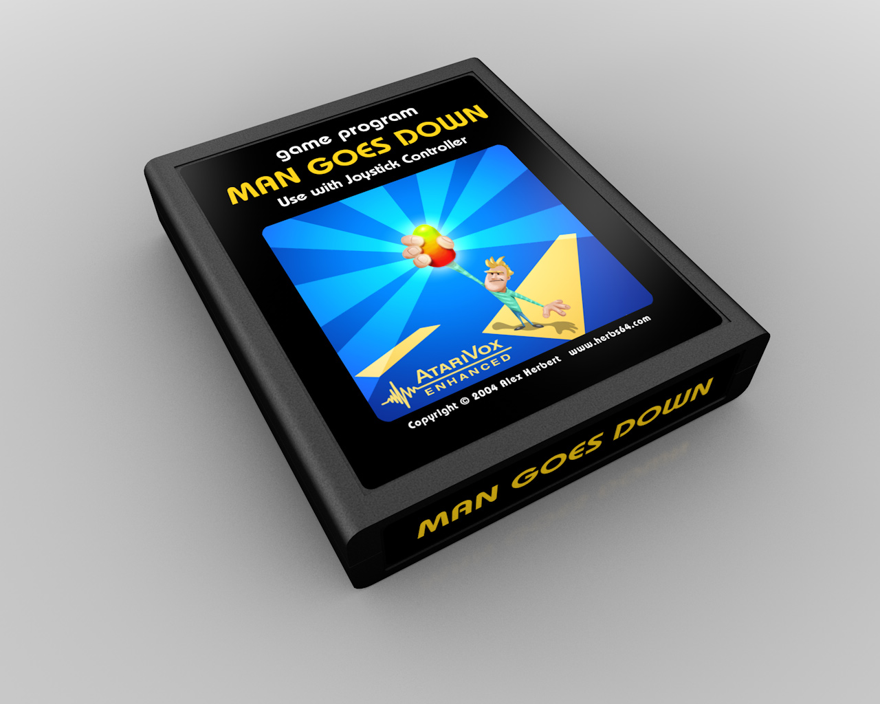
Oddly enough, I kept that basic composition for the Atari-style variations. The logo is still an unreadable mess though: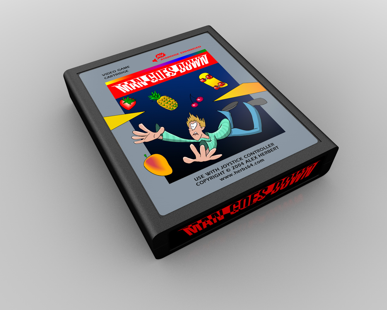
For this one, I should have had some of the elements breaking out from the picture, as I did in the silver-label version: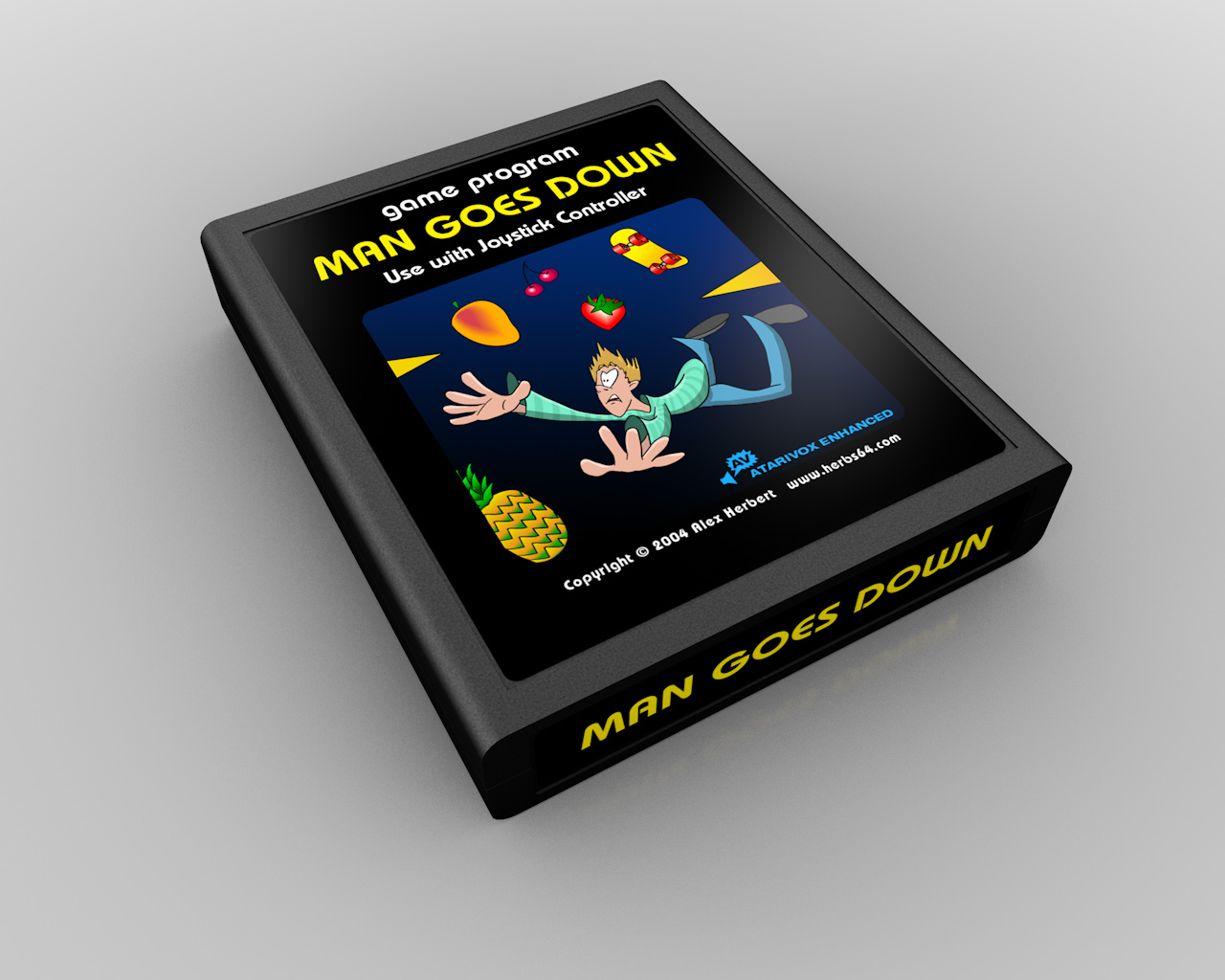
Back to where we started. The newspaper-style label is the final one I submitted, and the eventual winner. The "AtariVox Enhanced" font is (wait for it…) Wilhelm Klingspor Gotisch, and the headline font is Helvetica UltraCompressed.
There are only a few minor text differences between this and the final production version shown above: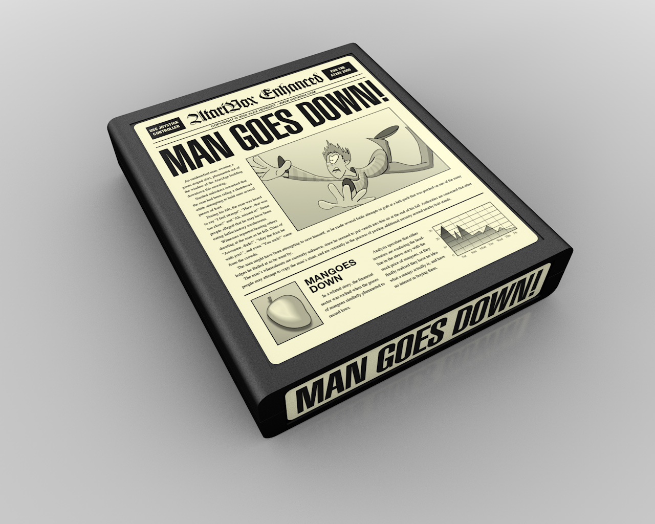
And finally, there was one more design that didn't make the cut, and never got submitted. The idea here being a chalkboard in a classroom. I don't think I ever really considered submitting it - more likely I was just playing around with Painter's chalk tools: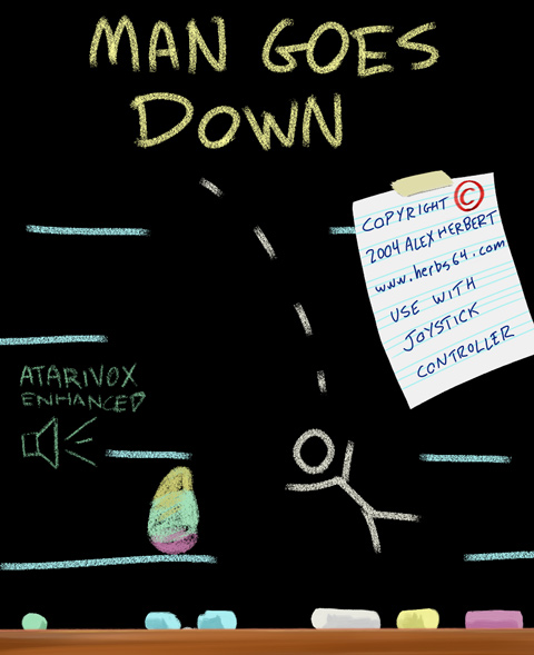
Next time… and you thought this was a long entry. ![]()
-
 2
2

2 Comments
Recommended Comments