Jump to content
  • entries
    974
  • comments
    5,031
  • views
    1,226,713

Draggin' Along


Nathan Strum

1,932 views

I finally wrapped up my contest entry for Medieval Mayhem, and sent it off to Albert.


I spent quite a lot of time on this one, and it'll likely be my only entry (well... three entries, one illustration).


This is the pencil drawing. Actually, it's a composite of four pencil drawings: the dragon, the castles on their hilltops, the mountain range and clouds, and the knight up on the wall:


mm_pencil_comp.jpg


The knight was actually a last-minute addition. My other (abandoned) idea was going to use a knight like this one, and I really felt there needed to be something up on that wall. A tower, a flag... something. So the knight got the call.


Drawing different elements on different sheets of paper (using a light table) is a holdover from learning animation. It allows me to re-work one thing, without messing up something that's already done. Once I've got sketches I'm happy with, I scan them into Photoshop, and put them together.


In the case of the dragon, I cleaned up the lines in FreeHand (a vector-based drawing program) before I started painting. I didn't do that with the rest of the elements, since I wanted them to have more of a rough feel to them.


mm_line_art.jpg


Then it was time to paint. The final file for this illustration (not counting label text to be added later) had 39 layers in it. At least seven of them are just dedicated to fire. :D The final artwork looks like this:


mm_final_small.jpg


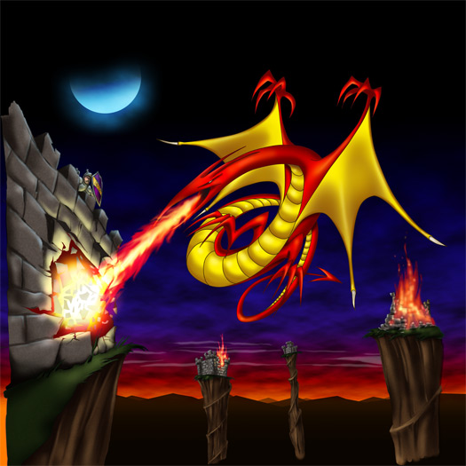
You can see the unfinished edges where the artwork will get cropped before going into the final label design.


Because I'm drawing on paper again and scanning it in (instead of just drawing directly in the computer), I ended up working at an extremely high resolution this time. Usually, I start off at maybe 800 x 800 pixels, but this one ended up at 4200 x 4200, which is completely overkill for a 2 3/4" wide label. For example, here's the knight at 100% size:


mm_knight.jpg


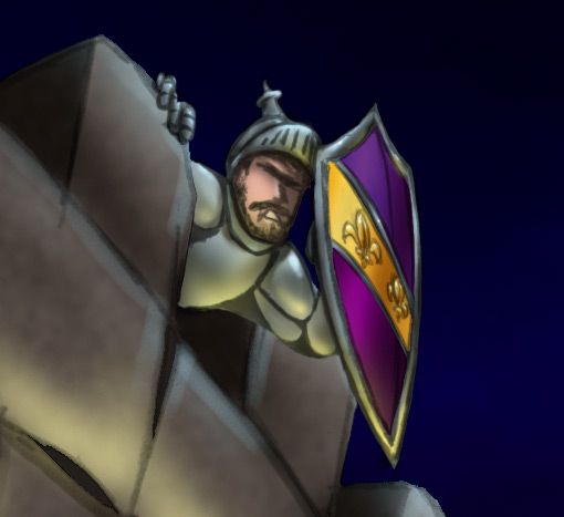
On the final label, he'll maybe be 1/4" across.


Oh well. :roll:


And finally, the finished label:


mm_final.jpg


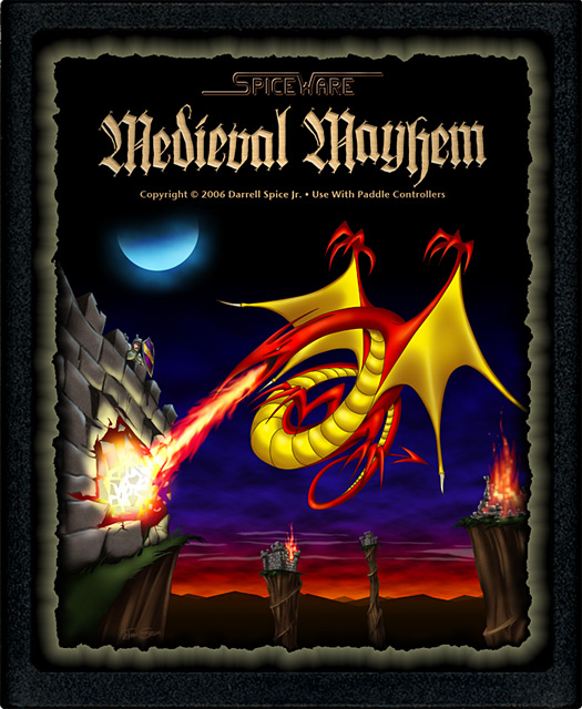
I distorted and offset the letters in the title a bit, to give more of a feeling of "mayhem" to them. It helped them match the energy in the rest of the illustration, too. Just having clean, perfect letters up there wouldn't have worked as well for this design.


I kept the dragon very stylized, since pretty early on there were already a lot of realistic (how can a fantasy creature be realistic?) looking dragons with sharp, pointy teeth being submitted. Besides - I'm a cartoonist. Not a photo-realistic illustrator. Go with your strengths, I say. :)


Overall, I'm quite pleased with how it turned out. The key turning point was getting the sky to look right. Once that happened, the mood of the scene was set, and that dictated how the rest of the illustration was painted.

17 Comments


Recommended Comments

Wow - nice work and great attention to detail ;) I predict that your work will be appearing on another homebrew label very soon ...

Link to comment

Cool! Damn, what talent!


In addition to everything else, I like how the moon seems to be in the appropriate phase given the location of the setting sun. Nice work.

Link to comment

Simply Spectacular!


Aside from the professional (and original!) graphics that manage to remain close yet add to the atmosphere of the game, I am particularly impressed by the thoughtful composition of this label, which so efficiently captures the essence of the gameplay.


The moody scroll type border for the labels rounds up a perfect design.

A professional artist's hand, obviously... ;)


Eric

Link to comment

Thanks, all! I appreciate the kind words. I guess we'll see what Darrell likes. ;)


I really like David Vazquez's entry. But then, I'm partial to the cartoony stuff. There's some nice stuff going on in there though. The crown over the letter "i" in Medieval, the playfulness of the dragon tossing the fireball in the air, and the character's overall design is very appealing. Plus, the whole label is very clearly designed and reads nicely at a small size.


A number of the designs are just too hard to read. Too busy or cluttered, or fonts that are too hard to read.


I really like the main font on this one from Joel Peguero though. Very clean, fits the design nicely, and really stands out from everything else.

Link to comment

Looks great! ;) Of the three, I like the "rough edges" variation the best.


This is going to be a hard decision, I really like a number of the entries. I plan to narrow the choices down to the few I like the most, then get my nephews' input as Medieval Mayhem came about because of them - we played a bunch of Warlords last Christmas.


David sent me his initial sketch. He has a low-res scan of it up on his site, it has more of the cartoony goodness. I like how he picked up on the crowns vs helmets per screen position.


Of Joel's I like entry 9 the best - the other font is neat, but to me it feels like it belongs on a space station.

Link to comment

I really like the main font on this one from Joel Peguero though. Very clean, fits the design nicely, and really stands out from everything else.

The font is nice, but IMO it doesn't fit to the theme. Some old fashioned looking font matches it much better (IMO!).

Link to comment

True, it doesn't fit the theme of the game, but it does fit the design of that label.


(I may have to use that font for a label someday, if I can find out what it is.) ;)

Link to comment
I really like David Vazquez's entry.


Yup, this would be my pick. Of course it all depends on wether one prefers a realistic or cartoonish approach. My goth side also likes Will Lutons first submission, excellent atmosphere found there.


So David Vazquez = espire8? That sure explains how he so absolutely managed to capture the dragon ;)


This is going to be a hard decision, I really like a number of the entries.


Back when I had to decide on the Gunfight label, I printed all submissions in the correct size on a color laser printer. Then my wife and me spread them all over to the floor. After that we took turns removing one after another, until only one was left :D

Link to comment

True, it doesn't fit the theme of the game, but it does fit the design of that label.


(I may have to use that font for a label someday, if I can find out what it is.) ;)

Joel is AtarikFroid

Link to comment

So David Vazquez = espire8? That sure explains how he so absolutely managed to capture the dragon :D

Yep - if you look around his site you'll find work on the easter egg :D


This is going to be a hard decision, I really like a number of the entries.


Back when I had to decide on the Gunfight label, I printed all submissions in the correct size on a color laser printer. Then my wife and me spread them all over to the floor. After that we took turns removing one after another, until only one was left ;)

I plan to print them out, but hadn't thought about the "remove one by one" - that's a good idea.
Link to comment

So David Vazquez = espire8? That sure explains how he so absolutely managed to capture the dragon ;)

Yep - if you look around his site you'll find work on the easter egg :D


This is going to be a hard decision, I really like a number of the entries.

Ooh no... :D That was suppose to be a secret! :D Now I know where all those hits I got on my site came from!

Oh well, I guess the real secret is in how to 'get' to the easter egg screen within the game itself. ;)


Btw Nathan- I did'nt know you had posted your work on your label here. I always like looking at WIP for art related stuff and your style is my cup of tea! That label of yours is something!

I had the same intention for WIP my new site but I think its a good idea to have a blog for the same.

Link to comment

Btw Nathan- I did'nt know you had posted your work on your label here. I always like looking at WIP for art related stuff and your style is my cup of tea! That label of yours is something!

Thanks! And I'm glad you had a chance to finish up your other label. I think it's excellent! It captures the feel of the game better than any of the other labels, and has some really fun characters in it. Nice work!


(P.S. I fixed the broken quotes in your previous post.)

Link to comment
Guest
Add a comment...

×   Pasted as rich text.   Paste as plain text instead

  Only 75 emoji are allowed.

×   Your link has been automatically embedded.   Display as a link instead

×   Your previous content has been restored.   Clear editor

×   You cannot paste images directly. Upload or insert images from URL.

Loading...
  • Recently Browsing   0 members

    • No registered users viewing this page.
×
×
  • Create New...