Jump to content
  • entries
    974
  • comments
    5,031
  • views
    1,226,715

b*nQ bl*G


Nathan Strum

906 views

Well, I was working on something completely unrelated... and decided to throw together another entry (or two) for the Q*bert b*nQ contest.


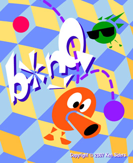
The other project I'm working on (another label and manual) is much more abstract, and uses flat, geometric shapes for the most part. So I decided to try that for b*nQ, seeing as how the approach is pretty much the opposite of what I already submitted.
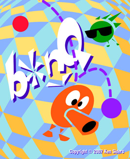
 

bonq2_ns.jpg


bonq3_ns.jpg


The colors aren't as intense as in my earlier entry. Also, with a lighter background, there's less contrast. The end result, is that although all of the shapes have hard edges, it still has a "soft" look to it.


As I mentioned in the other post's comments - contests are a good opportunity to experiment, and do something that I normally wouldn't do. There are some really good entries in the contest already, so it'll be interesting to see who wins. I like Renato Brito's entries the best, so far. But Gray West's has a lot going for it, too.


What I'm debating doing at this point, is submitting additional versions of my existing illustrations using a stock 7800 label template - to make it look like an "Atari" cart. It seems a little cheap to do that, but you never know what a programmer is going to like... :ponder:

7 Comments


Recommended Comments

"What I'm debating doing at this point, is submitting additional versions of my existing illustrations using a stock 7800 label template"


Evidently you decided to do it since they're all up there now. How did the original 7800 labels look? Was that big gray border gray or a silvery?


As much as I like bright, vibrant, saturated colors like your first label, there's something cool going on with these muted colors too. Almost a retro, 60's kind of style. Nice job.


There's some really stiff competition on this label contest. We're seeing some really cool, varied stuff. It'll be interesting to see which is picked.

Link to comment

The border was silvery. Although Atari later cheaped out on the printing. Even though they kept the labels silvery, they only printed one color (black) over them.


I can't say I care much for Atari's 7800 label design. But it was easy enough to replicate, so I went ahead with it.


Thanks for the compliment on the colors. My original passes on these were downright pastel, and far too muted. But FreeHand lets me assign styles to objects (I'm sure Illustrator does this, too), so I can just change a color in one place, and have it change all instances of that color.


There are a lot of good labels in this contest. I suspect that having a pre-existing character helps.

Link to comment
I'm sure Illustrator does this, too


Yep, a couple different ways. You can assign spot colors in the palette then use them either full strength or halftones of it. Change the color in the palette and all instances of it are updated within the document. You can also create patterns and drag them to the palette, maybe useful for something like your background, then apply that pattern to any shape. If the patterns use spot colors and change the spot, the pattern will also be adjusted. Kinda cool.


The new Illustrator still blows though. :)

Link to comment

Actually now that I think about it Illustrator also has a Graphic Styles menu that is probably closer to what you describe. It works similar to the Photoshop Actions menu.

Link to comment
The colors aren't as intense as in my earlier entry. Also, with a lighter background, there's less contrast. The end result, is that although all of the shapes have hard edges, it still has a "soft" look to it.


The colors look a bit loud on my screen, but that's not to say they'd be overly loud when printed. It's hard to judge how labels will look other than by printing them on a printer similar to Al's.

Link to comment

I've given up predicting how Al's printer will reproduce colors. :)


I keep my monitors calibrated, so I know I'm looking at the colors I want to see when I'm working. But in the end, I'm still at the mercy of his laser printer. After awhile, I just stopped worrying about it. I make the design look the way I want it to, and if it prints correctly, I count myself lucky.

Link to comment

This contest is really pulling in some amazing entries! There are a couple done with clay, and a few done with CG. (I'd love to do a clay one someday. I'll have to keep that in mind.)


I'm glad to see these coming in, since for some contests it seems difficult to get a lot of people to submit entries to them. I hope this is the start of a trend - it's great seeing all of these different styles.

Link to comment
Guest
Add a comment...

×   Pasted as rich text.   Paste as plain text instead

  Only 75 emoji are allowed.

×   Your link has been automatically embedded.   Display as a link instead

×   Your previous content has been restored.   Clear editor

×   You cannot paste images directly. Upload or insert images from URL.

Loading...
  • Recently Browsing   0 members

    • No registered users viewing this page.
×
×
  • Create New...