

Quart is in session
Entry posted by Nathan Strum
1,209 views
Well, it's almost the end of October.
And it's taken all month, but finally, it's here.
Baskin-Robbins Pumpkin Pie ice cream. My annual addiction, as I've mentioned a couple of times before in this blog.
So I've stocked up. I've got a quart of it in the freezer.
Which should last me about one, maybe two... scoops.
Well, they're open again tomorrow.
![]()
Speaking of food... I haven't really posted anything from the finished Gingerbread Man manual. I'm kind of holding off on posting the cover artwork in its entirety, until its official release rolls around. But I don't see why I couldn't post some of the other art from the manual.
I ended up doing four illustrations for the manual, in addition to the front cover (label) art. That turned out to be quite a bit of work, but I think it was worth the results in the end. When I've had the time, I've been really trying to bring a little bit "extra" to each manual that I work on. It'd be much easier just to dump them all into a generic template, but with all the work the programmers put into their games, I think they deserve better.
My favorite illustration for Gingerbread Man is on the back cover:
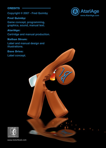
I really like the expression on his face, and that the illustration suggests a story. The trail of crumbs leading away is part of that story, although in hindsight, it's a little ambiguous. I meant it to show that something had just bitten him, and was leaving a trail of crumbs away from him. But after finishing it, I realized it also looks like something bit him a little while ago, and he's been leaving a trail of crumbs behind him as he's limping along. Either way, he's not happy about it. If there was a caption for this, it would have to be "Bite me." ![]()
This was the last one I finished, and by the time I got to it, I'd gotten pretty good at drawing and shading him, and I think he looks very "gingerbready". I also came up with a neat trick for figuring out how to draw a flat character like this. I traced his outline onto a piece of card stock, and then cut him out - like a paper doll. Then I twisted that into the pose I needed, held it out in front of me, and used that as reference. It really helped to see what a flat character like this was actually capable of doing, and it forced me not to cheat too much, which helped to keep it believable.
The reflection is an easy effect in Photoshop. If anyone's interested, I'll post a "how-to" on it. What really makes it work, is having the trail of crumbs crossing over it. That establishes where the floor is, even though you never actually see the floor itself. (And each crumb has its own reflection, too.)
One difference between this artwork and Elevators Amiss, is the use of self-colored lines. This is something that I first noticed in animation, where instead of outlining everything with black, they'd use a color similar to what the filled areas would have. This makes the lines disappear a bit more, and gives more depth to an image. I can put together a "how-to" on that, as well, if anyone wants to know more about it. There are a couple of tricks to it that I had to figure out to get it to work right.
6 Comments
Recommended Comments