

Incoming! parts 3 and 4
Entry posted by Nathan Strum
1,346 views
I'd only planned on doing two contest entries (and therefore two blog entries) for Incoming!, but things happen. So with that, I present parts 3 and 4 of the 2 part series on the making of my Incoming! label contest entries.
Part 3
After the first round of entries were posted for the contest I was thinking, "what else could I do that would be different?" I came up with some vague idea about using the gun sights of a tank, but didn't have a clear design for it. So I started Googling for tank gun sights. Nothing that came up interested me, and I was trying to think of someplace I could find a suitable high-tech, yet simple gun sight image.
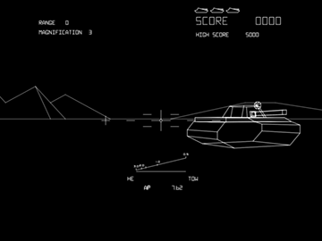
Then I remembered the Bradley Trainer. Never heard of it? Well, it's the official name of the long-rumored military version of Battlezone Atari created. You can watch a vintage news clip about it here. Cool, huh?
Anyway, the Bradley Trainer has a spiffy targeting sight in it, with crosshairs and numbers and stuff. So I thought it would be perfect:
I then decided it would become the basis for my entire label design for two reasons:
- Battlezone is my all-time favorite arcade game and it would be a way of paying tribute to it
- I've always wanted to make a label that looked like a vector game because vector games are cool

So I started working from screenshots, re-creating the vectors as line art in FreeHand:
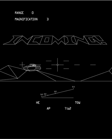
By reshaping and stretching lines and moving things around, I made the terrain more Incoming-like:
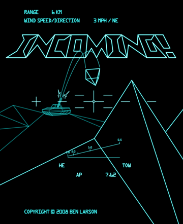
This had the vector look I was after, but it was missing a key element. It needed the enemy's incoming round to complete the picture. I added that, and then colored the vectors to look more like Battlezone:
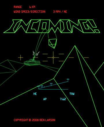
I took a few liberties by adding extra colors, to help distinguish the gun sight and HUD from the background.
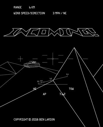
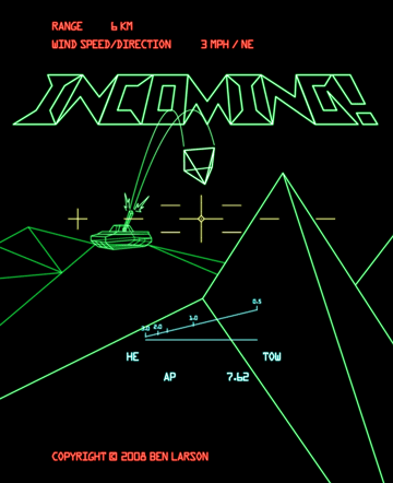
At this point, I felt it was good to go. But then I played around with Photoshop's "Black and White" adjustment controls, which remove color from an image, and can re-tint it. What I ended up with was a cyan vector image. It "glowed" better than the other one, and also reminded me of the early monochromatic vector games with light blue overlays like Tailgunner and Red Baron. I really loved the look of those games, so I decided to go ahead and submit it as an entry:
After that, I also readjusted the "Battlezone" version, so its glow matched the cyan one better, and submitted it as well:
Can you spot what's wrong with the tactical display? ![]()
Now, I didn't do this label with any intent of trying to win the contest with it. This was just done for fun, for me. It's such an esoteric concept that Ben would have to be a major Battlezone (or vector game) fan to even consider using it. But that's okay - I had fun making it. ![]() (In hindsight, I would probably change some of the letters on the HUD to include AA and my initials.)
(In hindsight, I would probably change some of the letters on the HUD to include AA and my initials.)
After I finished that, I figured I was done with the Incoming! contest for sure. Until this afternoon.
Part 4
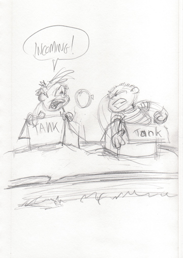
I was sitting around watching the Southern California wildfires on TV (which got within about 3 or 4 miles of where I live), and wanted a break from it all. Looking back at the contest page, I really liked the whimsey of SEgamer's first entry. So I was trying to think of something whimsical and fun. Silly and cartoony. No war machines. No fire. No explosions. Just kids playing "army tanks" in the sand. I thought of having them in toy tanks (like pedal cars), but then I thought - real kids would just make their own tanks out of cardboard boxes.
And so I started sketching. As I was drawing, it evolved from them being on wide-open sand (the beach) to a sandbox at a playground. The idea of them being in such a confined space just made the whole thing more... comforting. They were obviously some place safe and familiar. No misunderstanding about them being stuck out in the middle of a real desert somewhere. Plus, I really liked their ridiculously close proximity - it just felt like the way kids would play. And of course the weapon-of-choice had to be a water balloon:
I wanted to keep as much of the feel of the sketch as I could, so once again I turned to Painter, and just painted the entire label there. Really rough, really fast. The end result is something I'm completely delighted with:
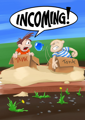
Does it have anything to do with the game? Hardly. But again, I'm not entering this one with the intent of trying to win. I did this for fun. I needed fun today. I think during the Lead contest, I got so wrapped up with making a clean, polished label - a "winner" - that I lost some of the fun that needs to be inherent in creating art in the first place.
Now, I'm having fun again. ![]()
7 Comments
Recommended Comments